Kunde
Roskilde Festival
Bureau
Spring/Summer
Krediteringer
Beskrivelse
More than music
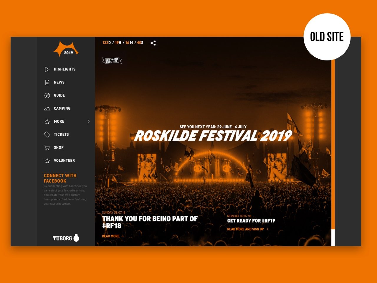
They say you can't teach an old dog new tricks, but Roskilde Festival doesn't buy into that. Over the years the festival has become about more than music — art, activism and culture are as much a part of the experience now, and we wanted to reflect that in their website
Making the content
worth discovering
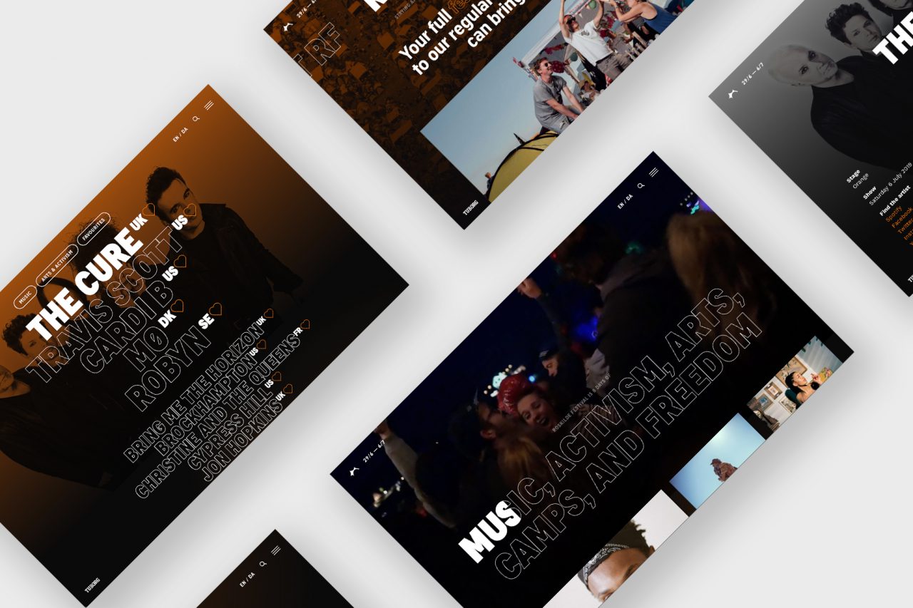
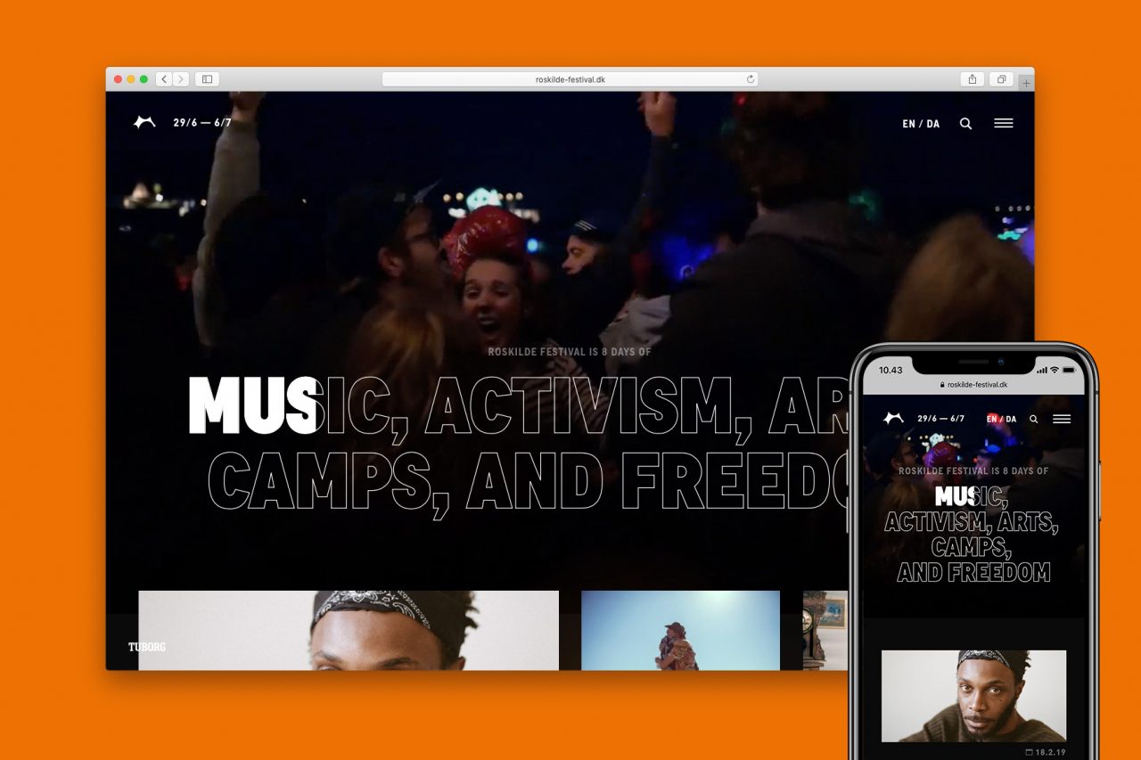
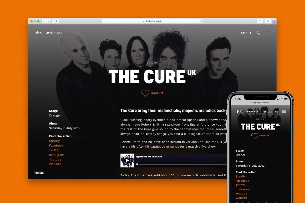
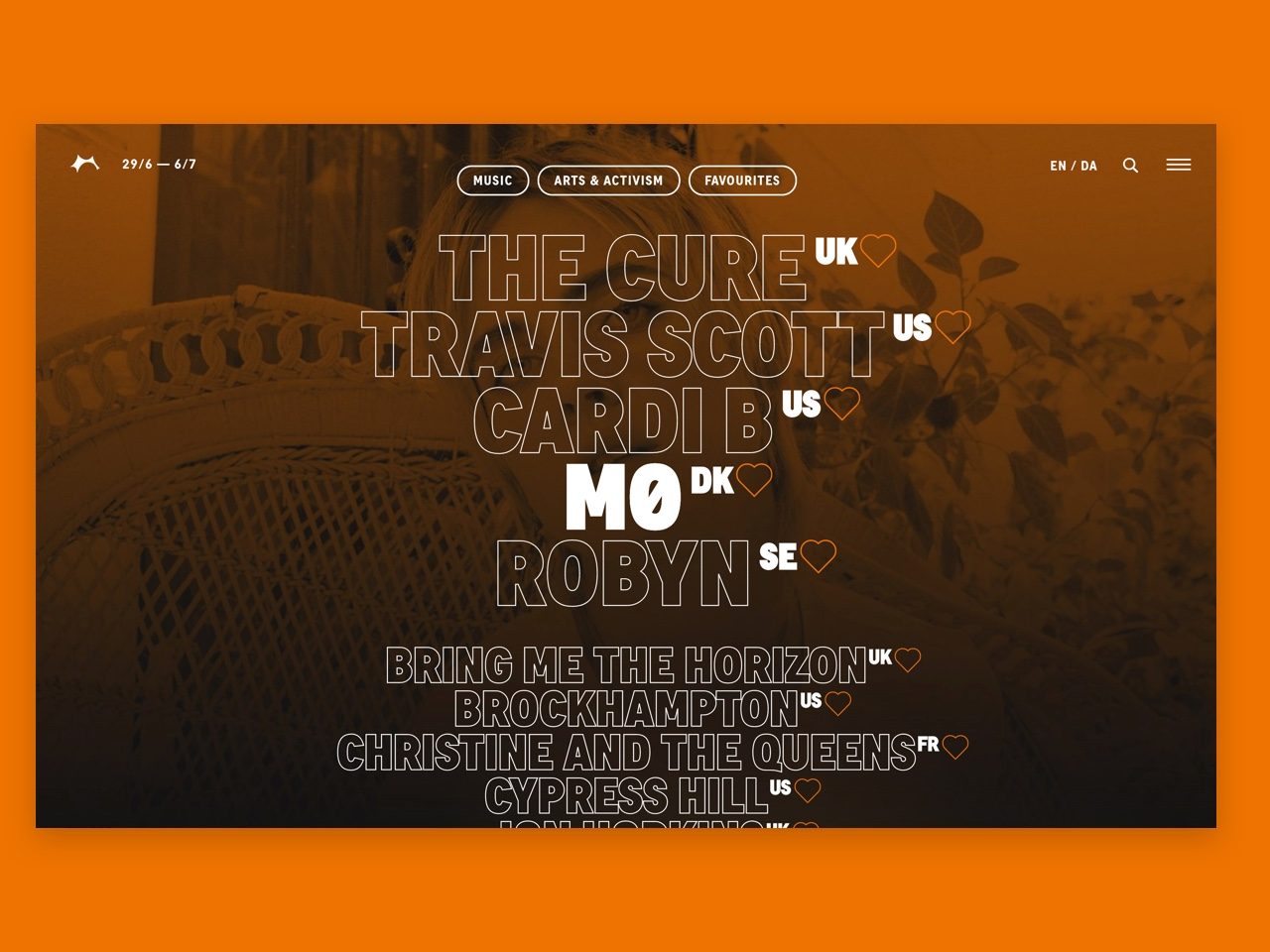
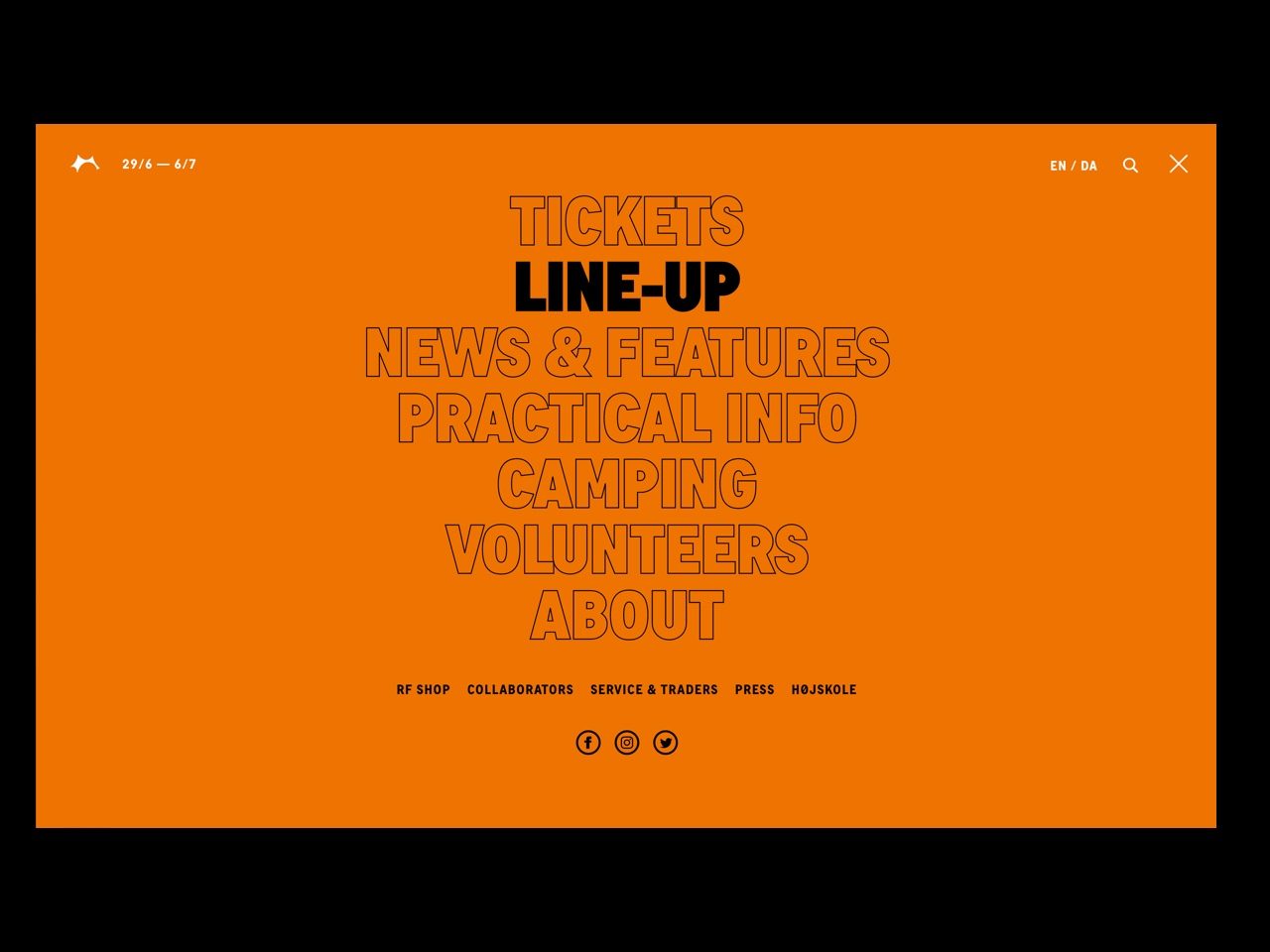
We had a mantra throughout the design; if we wanted people to re-discover what the festival was about, we needed to make the site interesting and fun to explore. It seems relatively simple, but from that, a dark and mysterious visual direction was born (reminiscent of lights in the night). Light is used to guide the interaction, like when elements fade in while scrolling or outlined type is filled up. Content reveal surprises, like images appearing when hovering over certain words, and is placed in an asymmetrical grid that makes it seem dynamic and alive.
Flexible and dynamic
in its structure
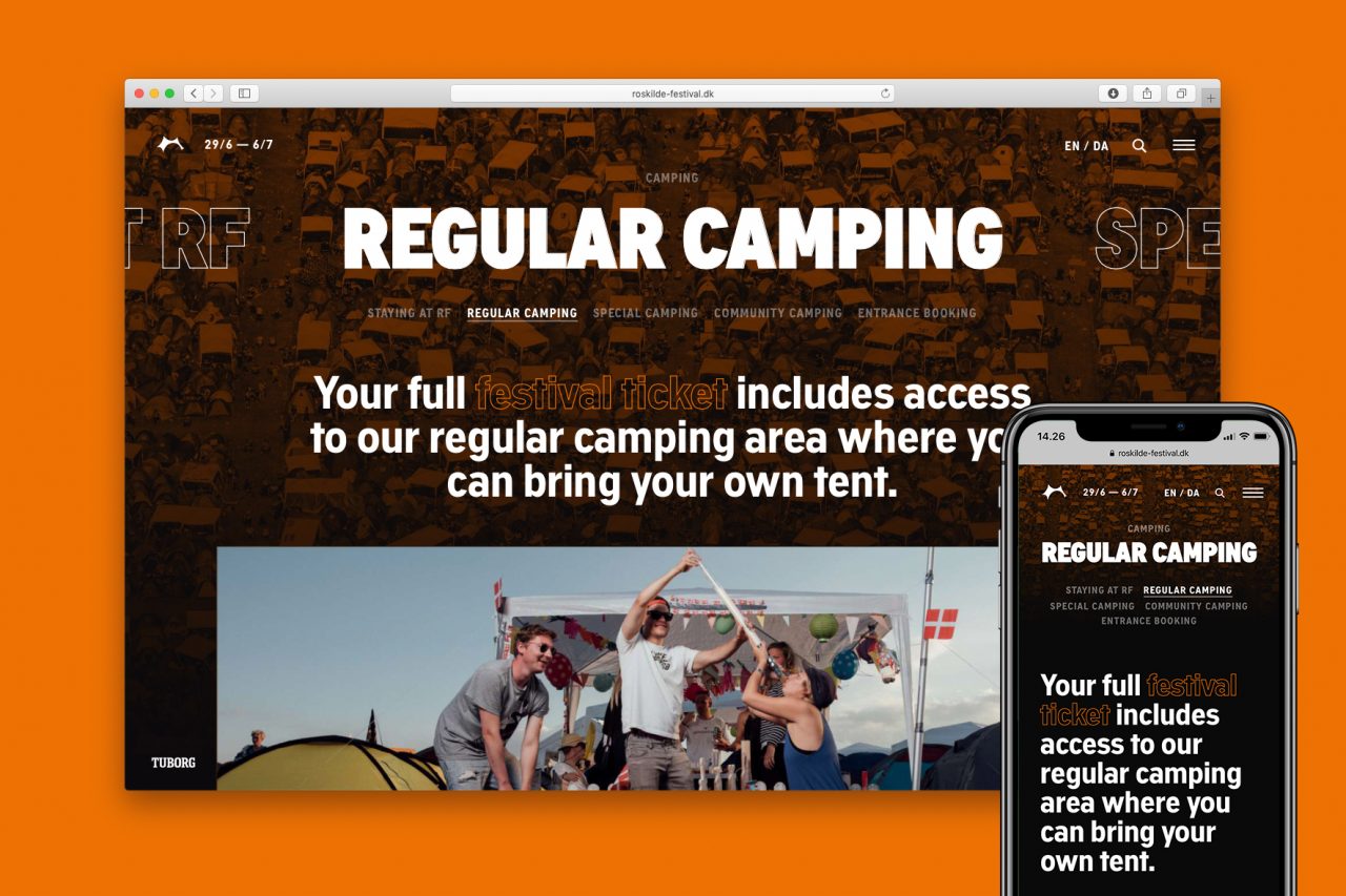
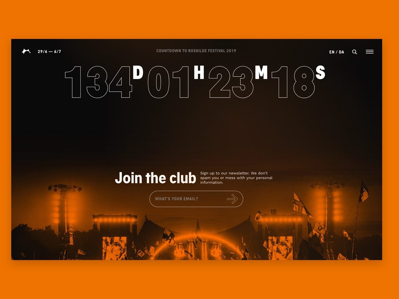
We identified from the beginning that the festival had a need to dramatically shake things up on the site; from year-to-year, but also from 'season-to-season' — there's a huge difference between what should be communicated when the tickets go on sale to what's interesting a week before the festival starts. That influenced the design and development, and the result is a totally modular website that can have very different faces depending on when you visit it.
Conveying 'The Orange Feeling'
For many, the most important aspect is the culture — the vibe, and the values of the festival. That's why we packed it into every corner we could find — from page loaders and background imagery down to the way we use typography and animation.
Shortliste
CCA 2019

