Kunde
Jorgobé
Bureau
Studio C
Krediteringer
Beskrivelse
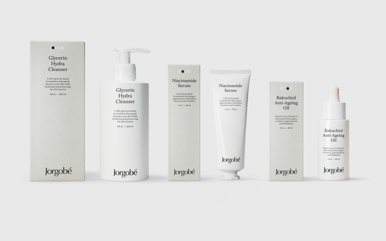
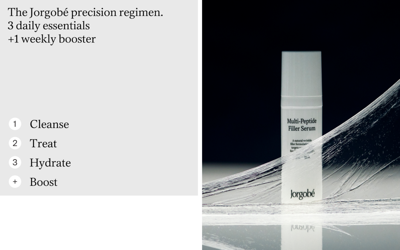
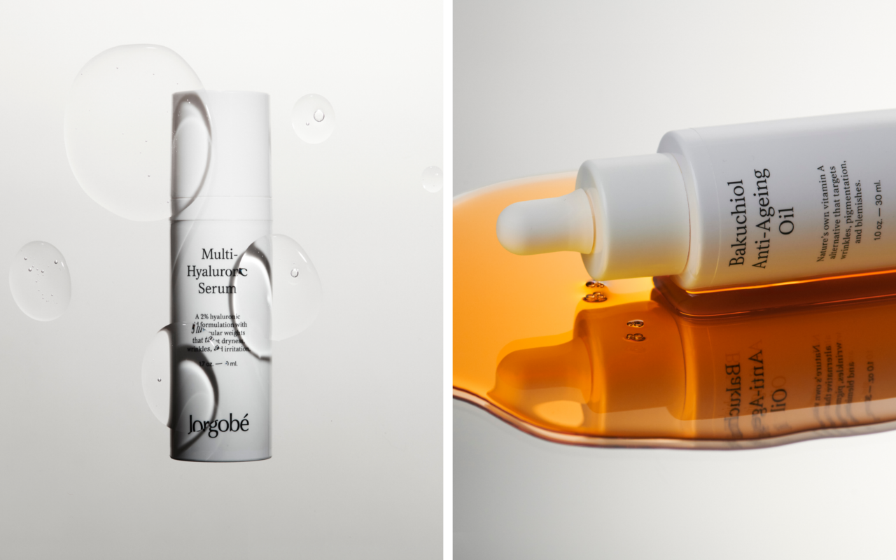
Together with Jorgobé’s founders, we developed the concept of Precision Skin Health—a philosophy that shaped the brand’s communication and design across all touchpoints. This concept is reflected in Jorgobé’s precision regimen, a streamlined yet effective routine: three daily essentials, morning and evening, plus one weekly booster. Nothing more, nothing less—just what your skin needs.
The new packaging design brings this concept to life through clear text and iconography, ensuring customers instantly understand where each product fits within the regimen and how to use it. Beyond function, the packaging also provides full transparency—listing all ingredients directly on the product.
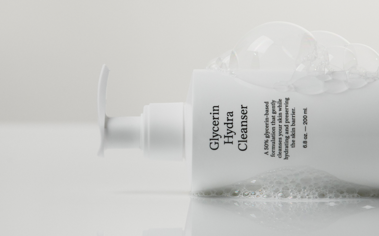
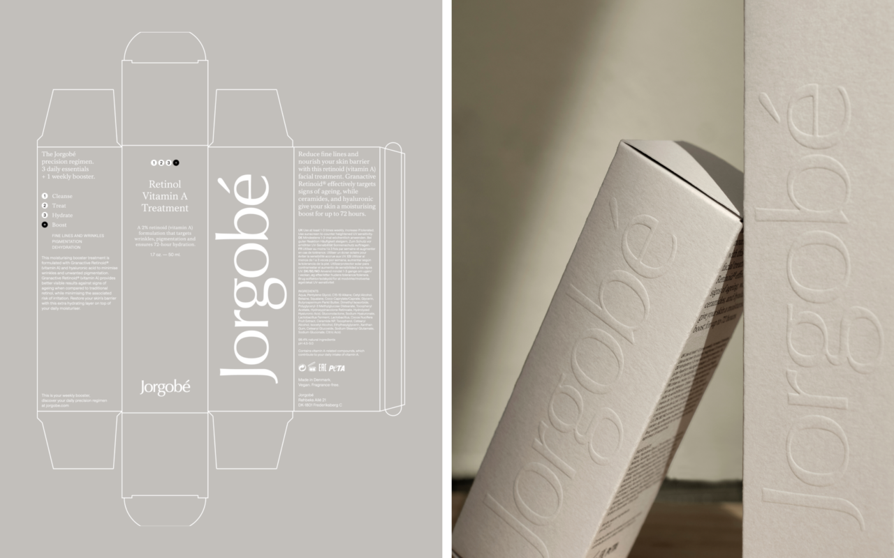
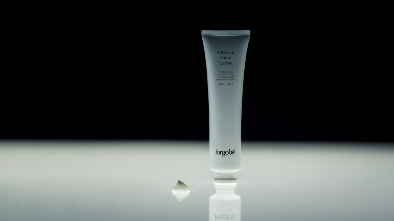
With an educational approach at its core, the design prioritizes legibility while maintaining a delicate, simple, and premium aesthetic. The signature grey brand color complements the white primary packaging, while Munken Polar Rough Uncoated paper reinforces the brand’s refined, tactile experience.
To enhance the sense of craftsmanship, embossing is applied to all logos and regimen steps on secondary packaging—underscoring Jorgobé’s commitment to precision at every level.
Shortliste
CCA 2025