Bureau
BASEBORN
Krediteringer
Beskrivelse
SNUW – A Brand That Smiles Back
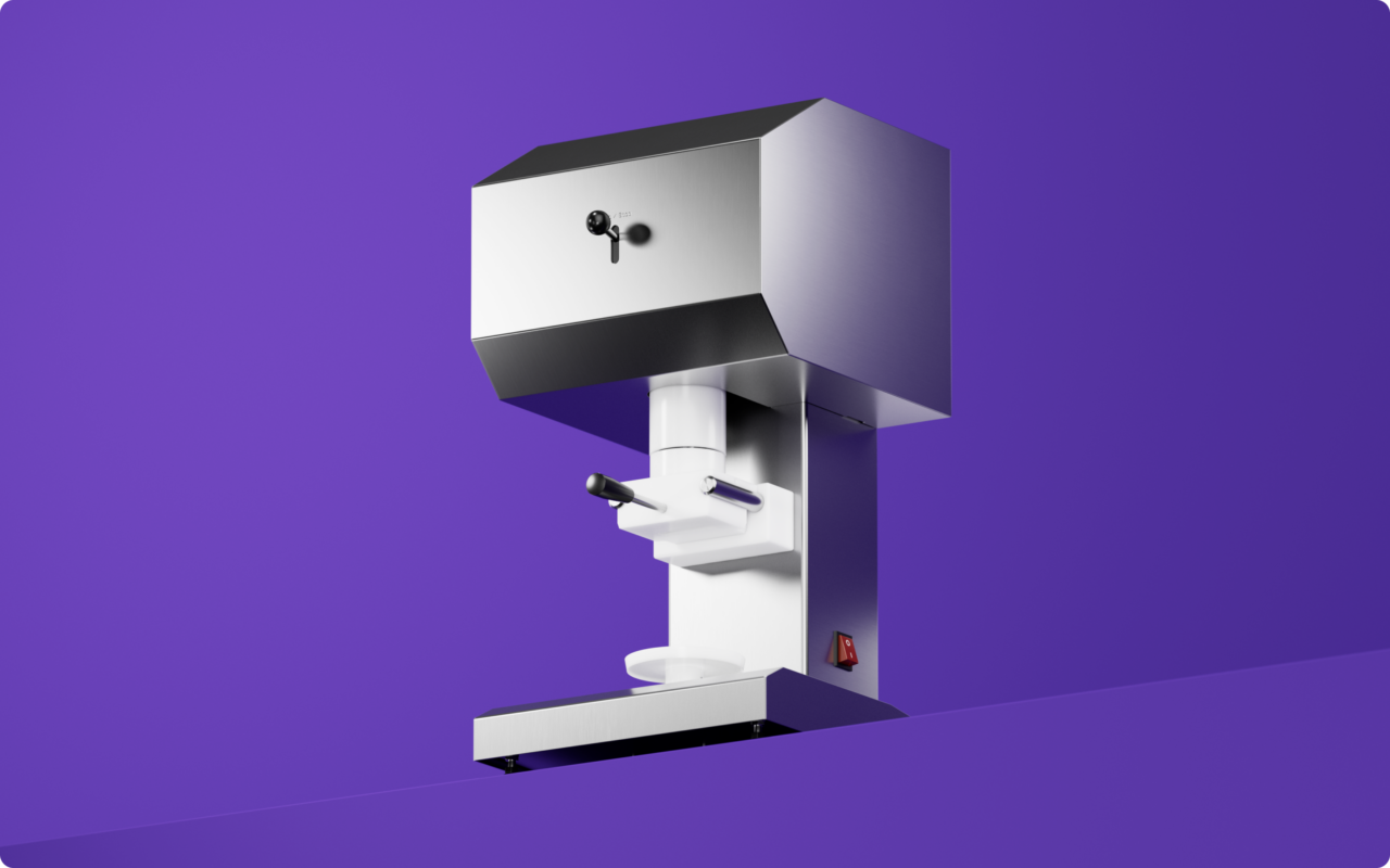
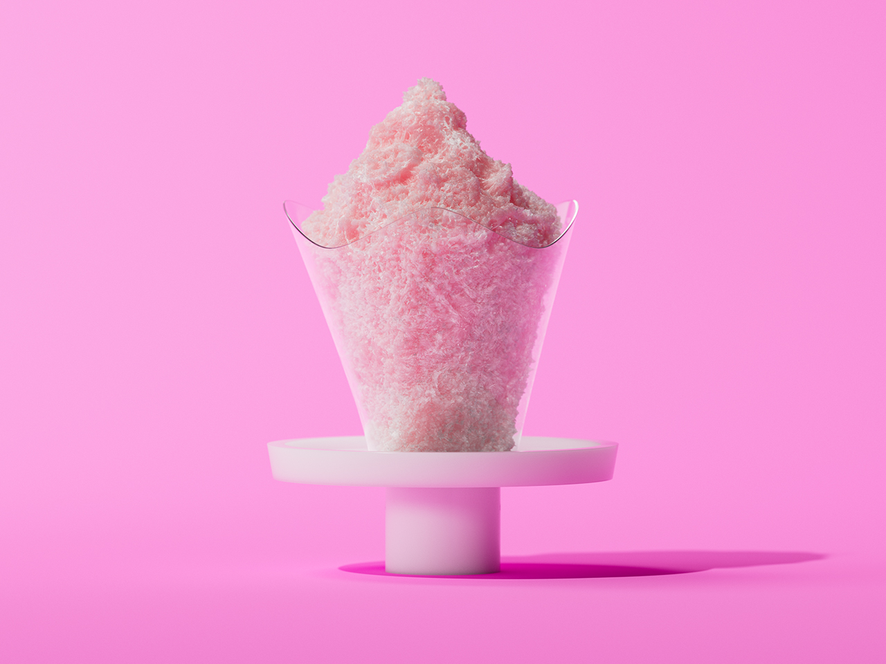
SNUW is more than just a frozen guilt-free treat in a cup, it’s a brand built on the belief that a little joy can go a long way. Born from the idea of making life lighter, one scoop at a time, SNUW was inspired by its founder’s own experiences. It was created not only to offer a tastfull experience but also to foster a sense of well-being. At its core, the brand is dedicated to supporting mental health and individuals with special needs, creating a space where everyone feels included, uplifted, and valued. And because happiness is best when shared, the brand is on a mission to let it SNUW all year round!
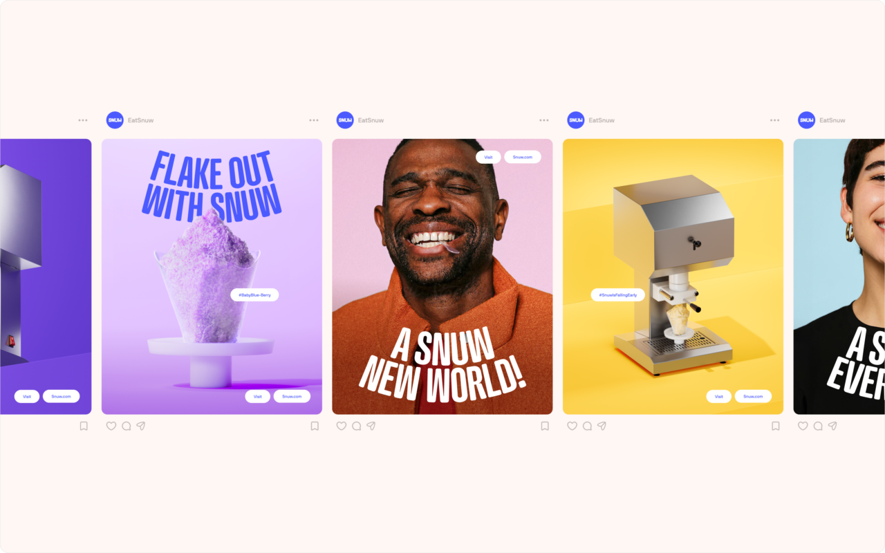
The identity is inspired by the lightness and joy of snow, both in the product and its visual expression. The name itself is a playful twist on the word "snow," capturing the soft, airy texture of the frozen treat.
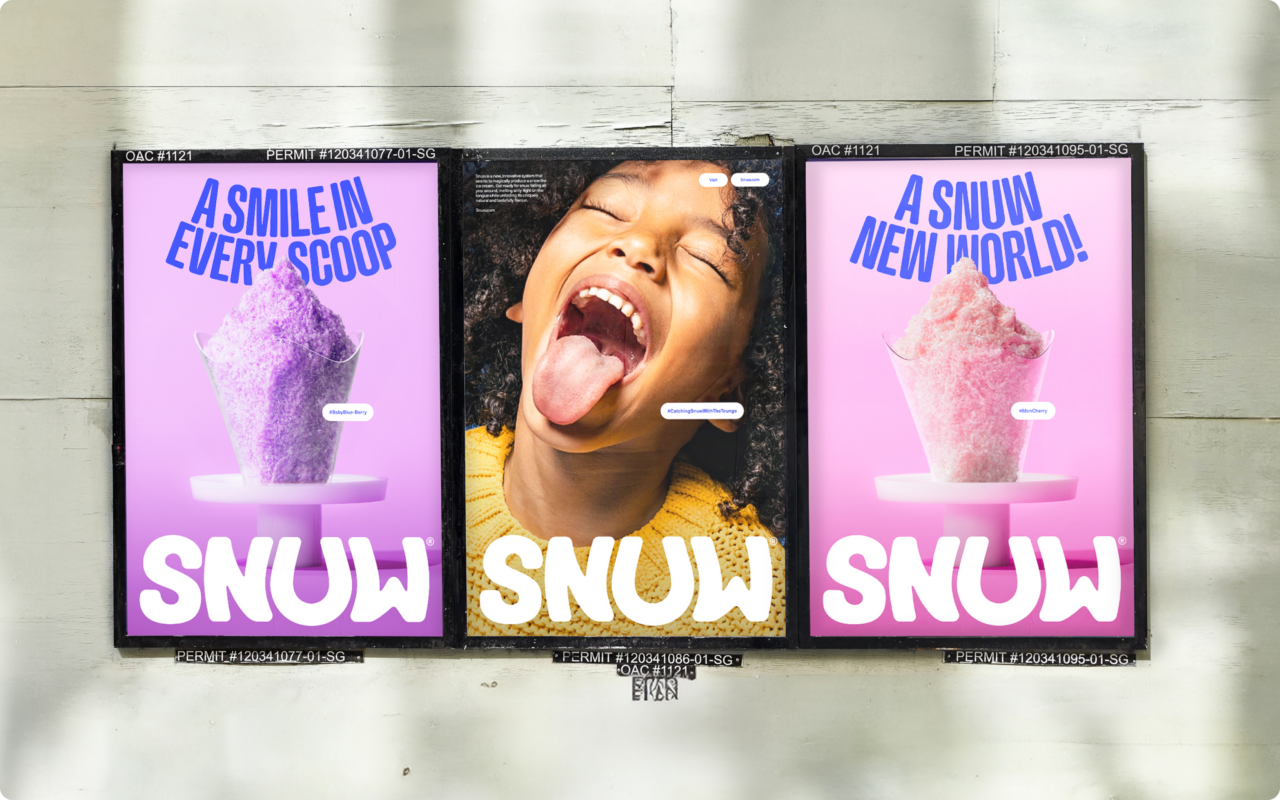
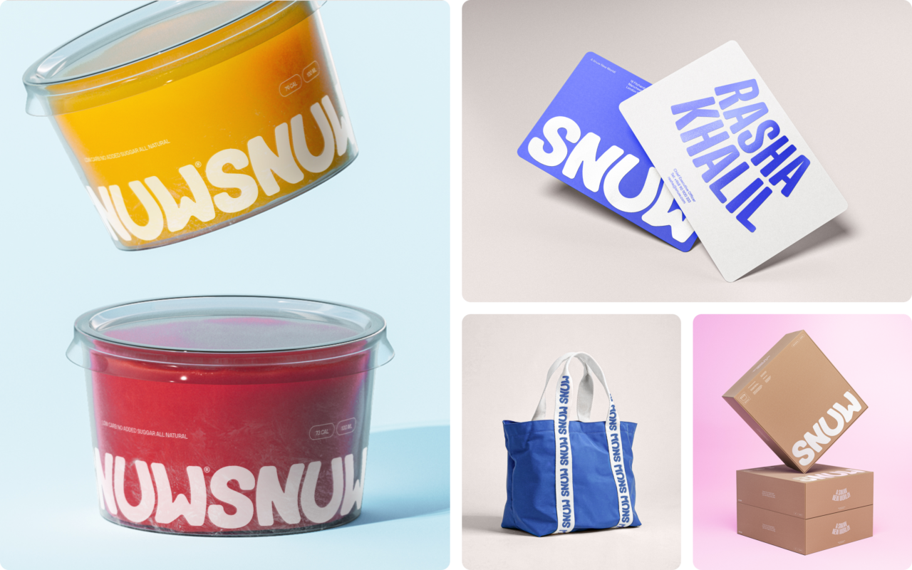
Visually, the brand is built around the simplest, most universal sign of happiness: a smile. The logo does more than just spell SNUW. At the heart of it, is the letter “U”, shaped into a smile. stretching the surrounding letters. Making the logo smile along with its customers. This core idea extends into the entire design system, influencing the way headlines curve and interact throughout the brand. The color palette is equally expressive, drawn from SNUW’s vibrant flavors to create a dynamic and joyful visual language throughout layouts and photostyle. The result is a brand identity that feels playful, and uplifting as the product itself, transforming a simple frozen treat into a moment of happiness.
Shortliste
CCA 2025