Kunde
Call me
Krediteringer
Beskrivelse
Call me was launching an entirely new brand platform, making their way back to the heart of the brand - many remember the ‘Tal ordentligt’ campaign - that had disappeared in between tactical and price-driven communication.
Task: The new brand platform - ‘Connecting with Care’ - also called for a new visual identity, which brought feeling and human connection back to the brand. And that very purposely didn’t use an illustrated mascot. Functionally, the previous identity was based on a color, a mascot, and a ‘yelling’ font, that made every word seem like an exclamation. A limited toolbox, which was hard to take ownership of and execute on in everyday life.
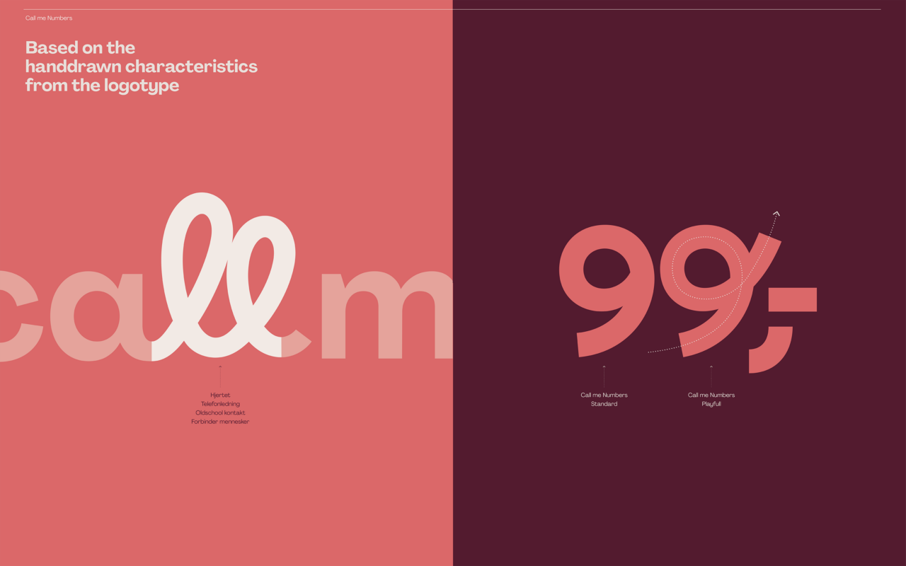
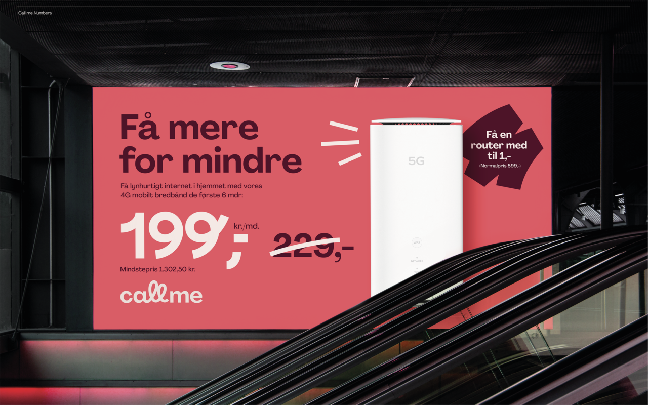
Solution: The new logo comes from the human connection in both content and expression. The hand-drawn ‘double l’s’ in ‘Call’ represent both the old-school connection - the curly phone cord - as well as a heart, symbolizing relations and connection between people.
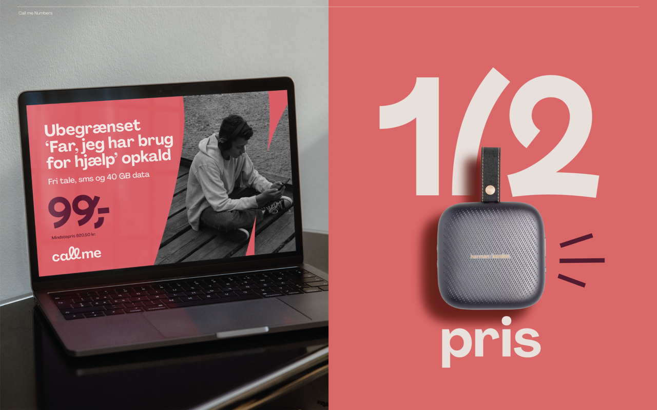
The heart from the logo also acts as the 5th element and can represent the logo when acting in small spaces. In the same drawn style, a set of doodles is available to support messages, feelings, senses, and sound.
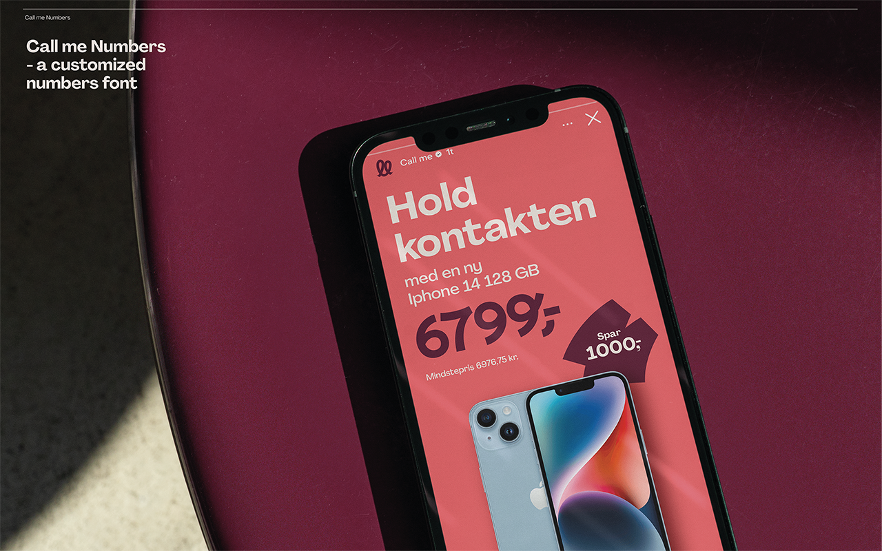
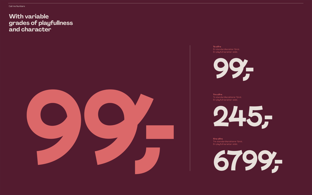
The hand-drawn quality of ‘double l’s’ continues in a specially developed numbers font because numbers sometimes become one of the most important elements in tactical messages. The hand-drawn numbers come to symbolize the connection when the logo and fifth element become secondary. The font comes in two styles - a regular style and a more playful style. The font is coded to balance the two, to create harmonious and easily readable text. When putting the brand into words, small letters make the copy approachable and easy to ‘connect’ to.
To further refresh the brand, we’ve created a new set of red colors - a bordeaux and a coral. These two make up a unique combination and stand out from all other ‘red’ brands in surrounding categories - and when combined, they express a soft, human contrast."
Shortliste
CCA 2024

