Kunde
Farm To Me
Bureau
Kontrapunkt
Krediteringer
Beskrivelse
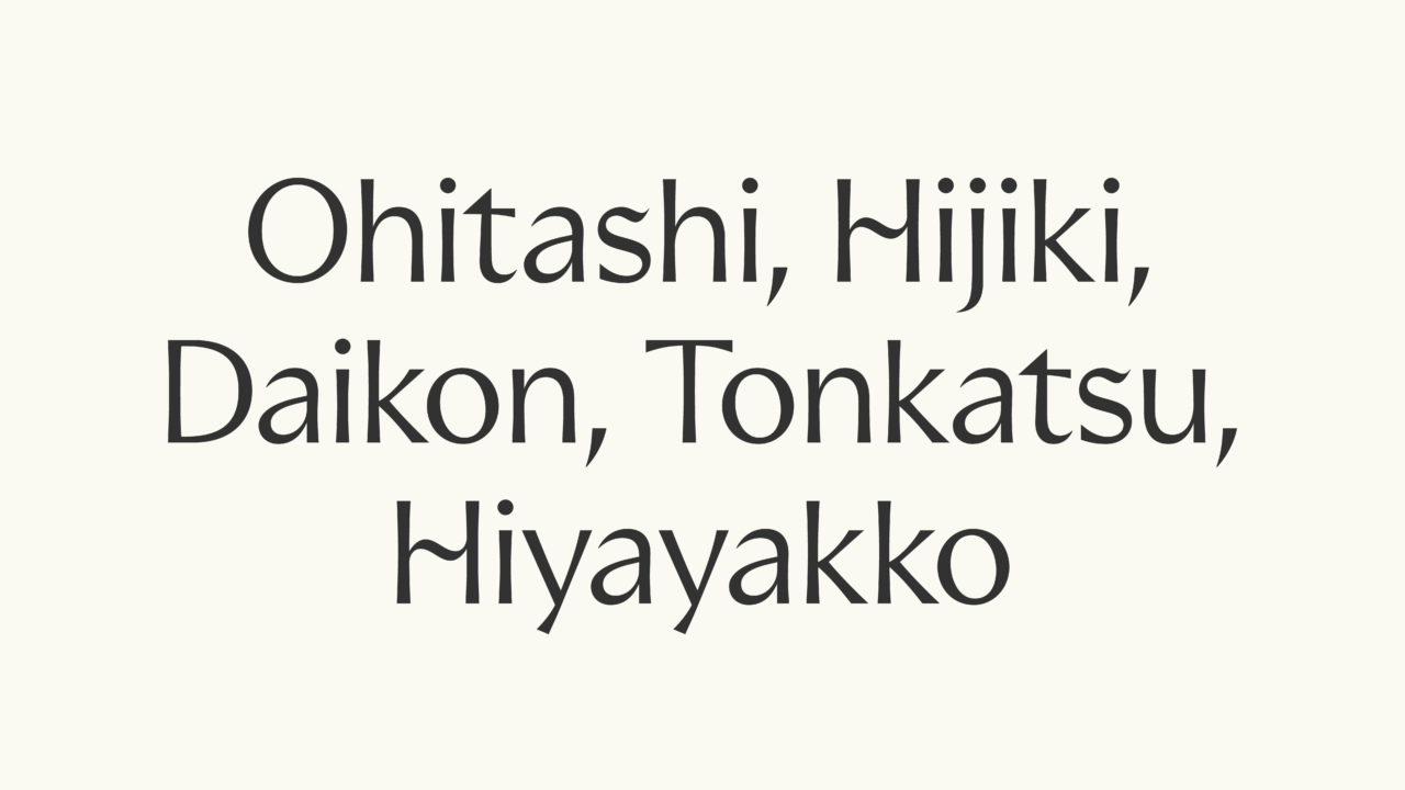
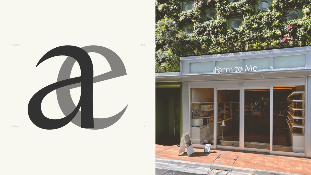
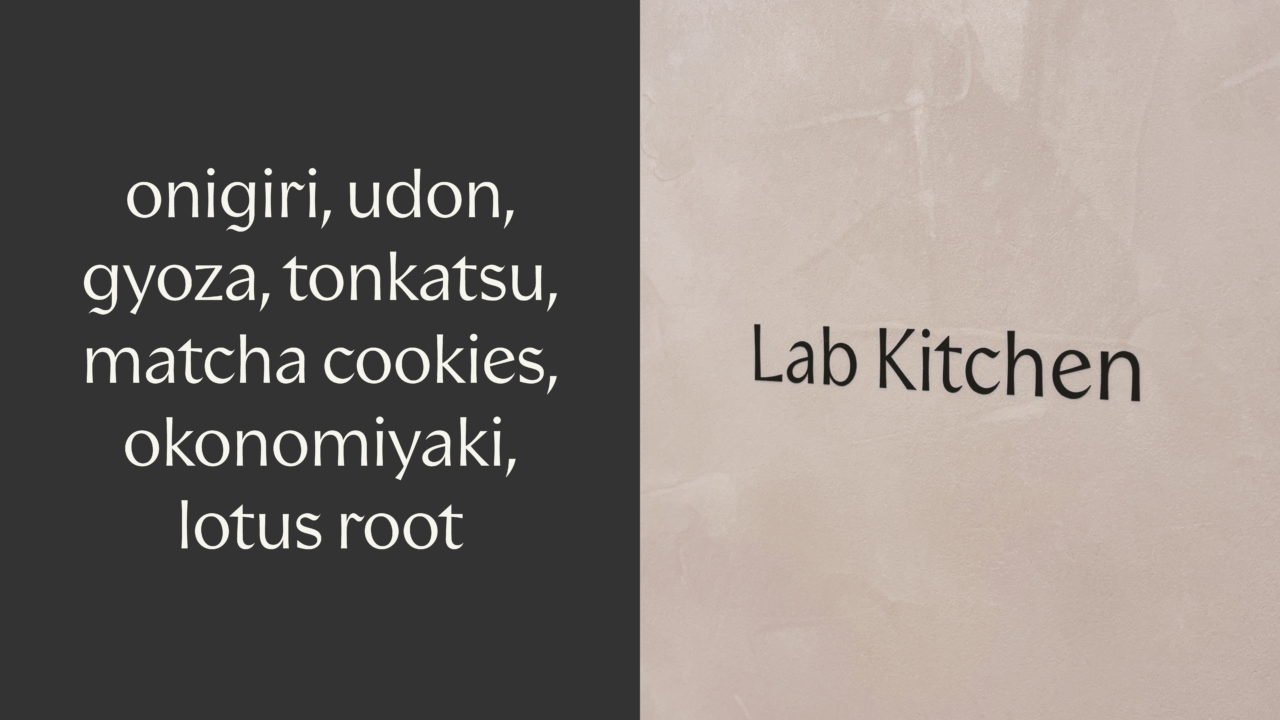
Farm to Me brings the people of Japan’s capital closer to nature, offering fresh goods sourced directly from local farmers. To capture this holistic approach to food consumption, we created a bespoke typeface rooted in nature’s soothing and harmonic qualities.
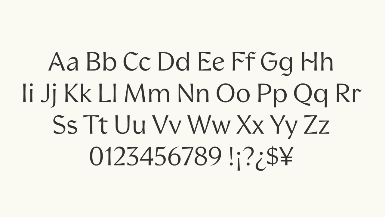
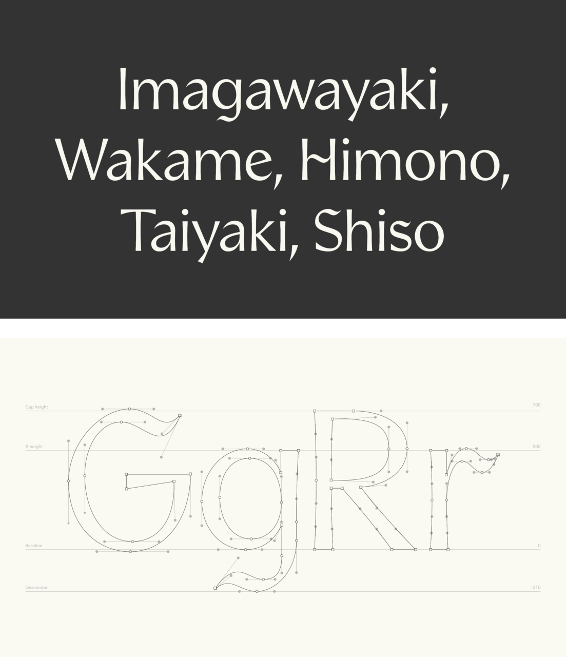
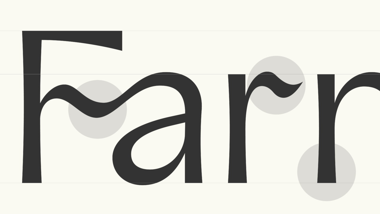
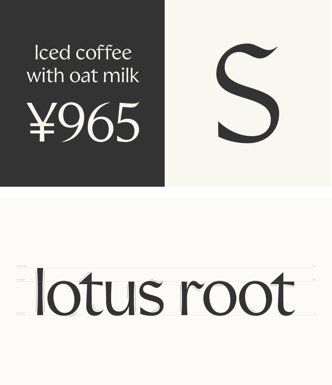
The typeface embodies refined simplicity, drawing inspiration from nature’s gentle curves. Organic, flowing pen strokes and unexpected ligatures blend in amongst this high-contrast, delicate sans-serif. No stem or stroke is a straight line; they are all tapered and carry a subtle curvature — just like the rhythms and lines of our natural world. As a result, its distinct nature makes it well-balanced and legible, ensuring every written word feels as down-to-earth, elegant and inviting as the goods Farm to Me offers.
PDF Filer
Shortliste
CCA 2024

