Kunde
Flying Tiger Copenhagen
Beskrivelse
Background
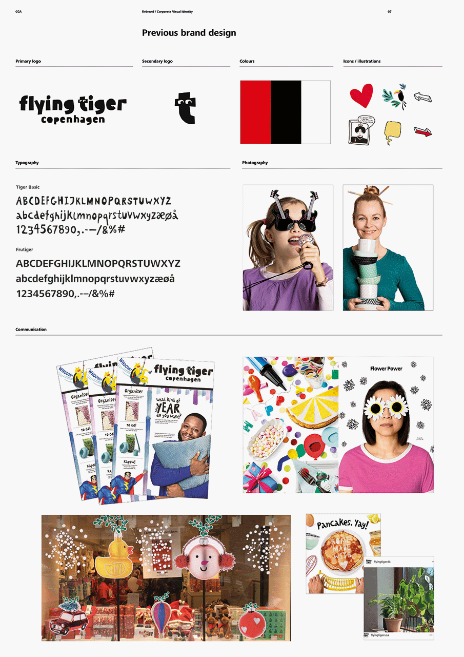
Flying Tiger Copenhagen had a logo that wasn’t
activated. Because of rapid expansion into new
markets, their visual appearance was becoming
increasingly inconsistent across countries and
media platforms. It was not reflecting their
uniqueness, thus not building a strong brand.
Brief
Create a visual identity that support’s the core brand idea: that
Flying Tiger Copenhagen’s products are designed to make
relations happen and people happy. And create it in a universal
language, that will be understood across all markets.
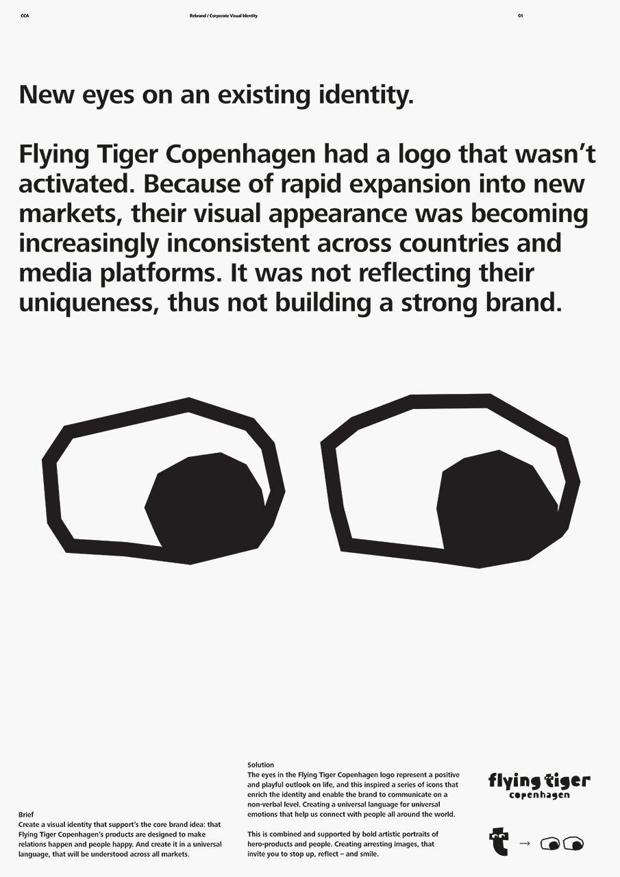
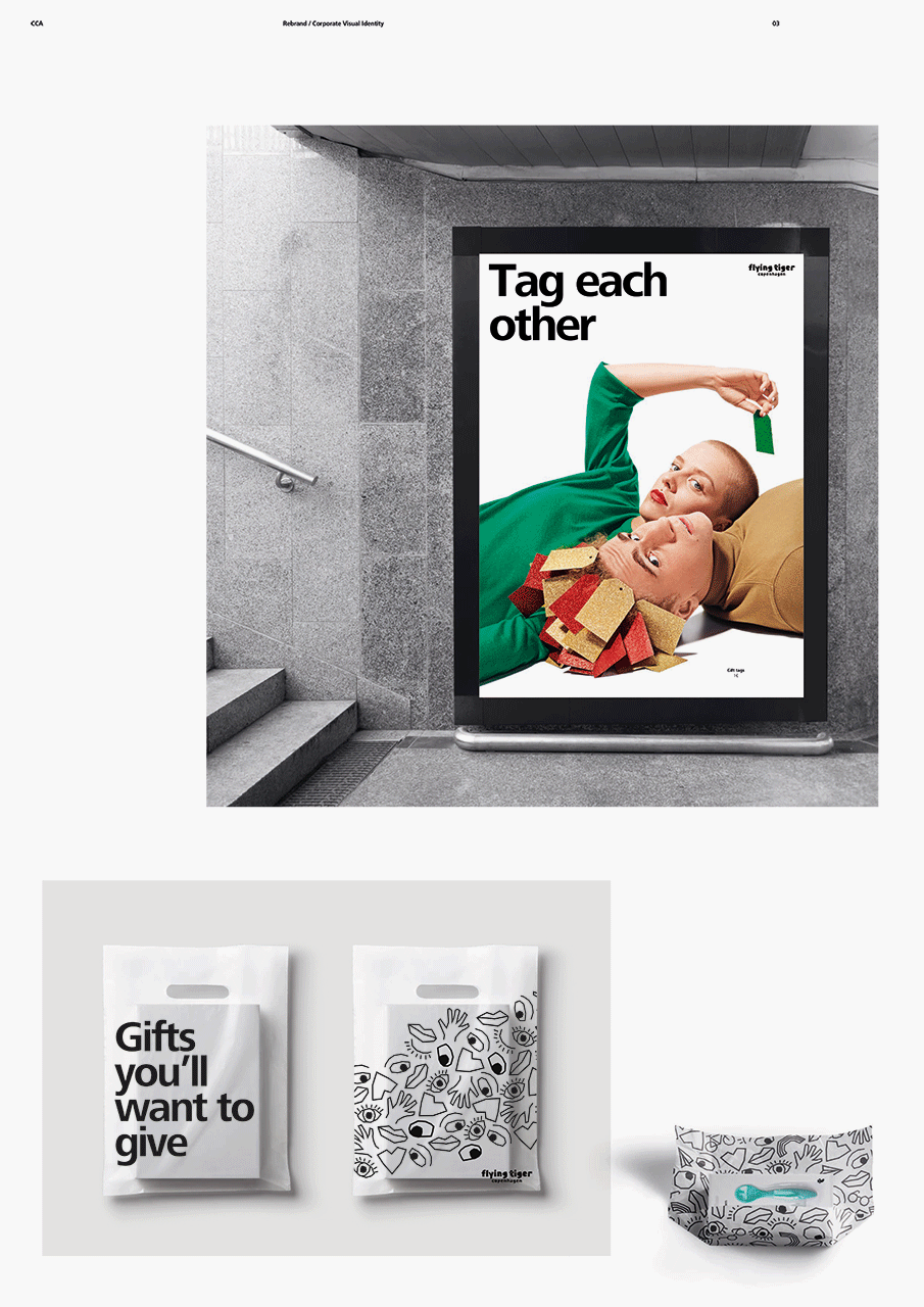
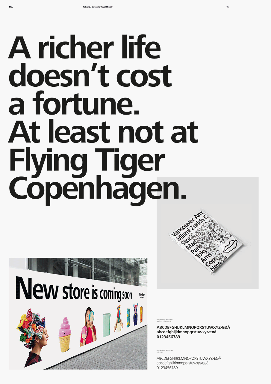
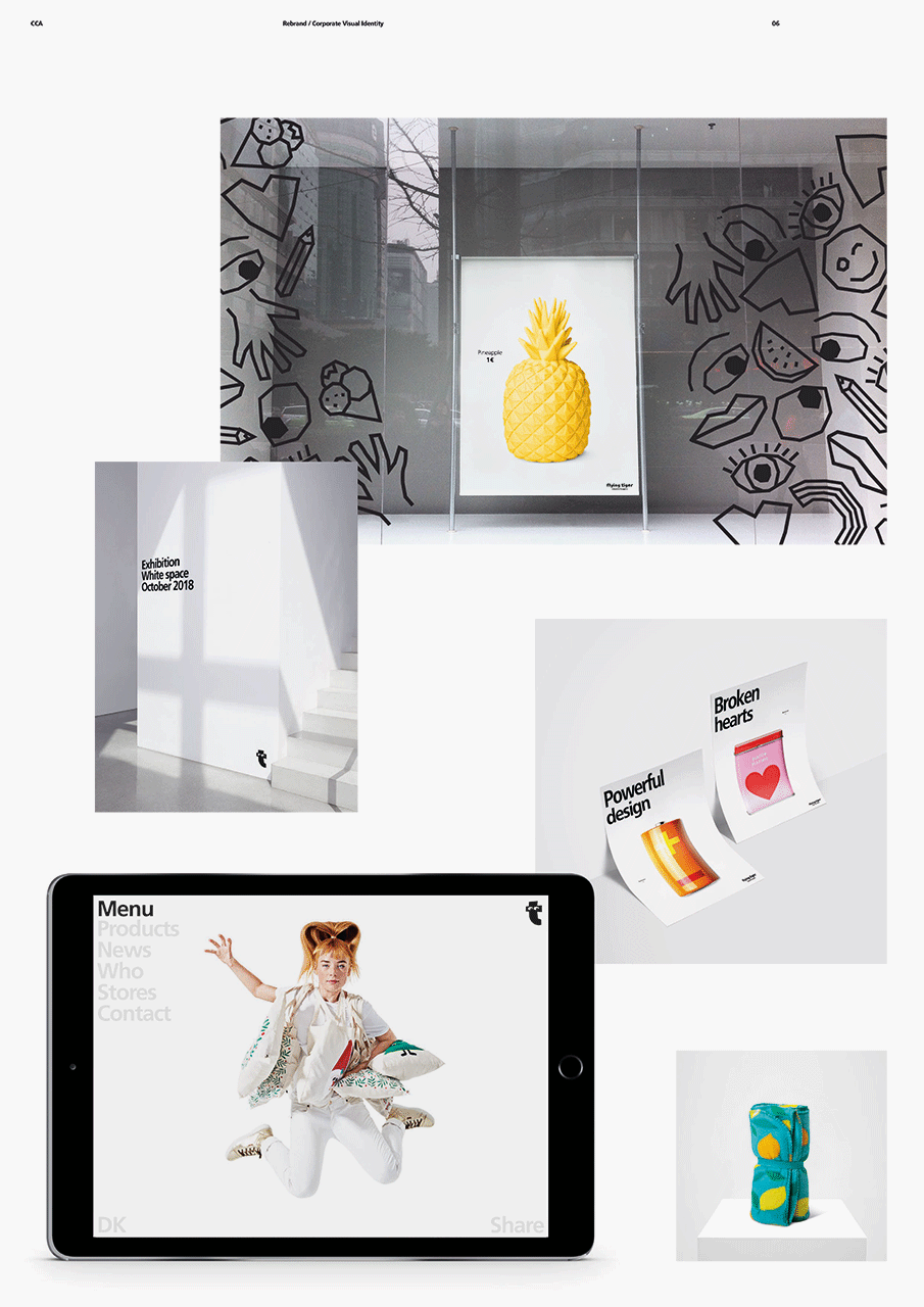
Solution
The eyes in the Flying Tiger Copenhagen logo represent a positive
and playful outlook on life, and this inspired a series of icons that
enrich the identity and enable the brand to communicate on a
non-verbal level. Creating a universal language for universal
emotions that help us connect with people all around the world.
This is combined and supported by bold artistic portraits of
hero-products and people. Creating arresting images, that
invite you to stop up, reflect – and smile.